
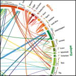

I just spotted this lovely chart over at Quartz. Coming from a city with a huge immigrant population (NYC!) this definitely piqued by interested. The chart was created based on data compiled over 20 years, from 1990 to 2010 in a study conducted by geographic researchers from the Wittgenstein Centre for Demography and Global Human Capital in Vienna.
(click to enlarge)

Two things which really stand out from this data:
It’s not the poorest who migrate the most
While the results of the migration study aren’t particularly groundbreaking, there are two interesting insights:
1) Adjusted for population growth, the global migration rate has stayed roughly the same since around since 1995 (it was higher from 1990-1995).
2) It’s not the poorest countries sending people to the richest countries, it’s countries in transition—still poor, but with some education and mobility—that are the highest migratory contributors.
“One of the conclusions they make in the paper, is the idea as countries develop, they continue to send more migrants, and at some point they become migrant-receiving regions themselves,” says Fernando Riosmena, a geographer from the University of Colorado, who did not contribute to this research, but is collaborating with one of the authors on a future paper
Also, in terms of emigration from Sub-Saharan Africa:
There’s a huge circulation of migrants among sub-Saharan African countries. This migration dwarfs the number leaving Africa, but the media pay more attention the latter because of the austerity-driven immigration debates in Europe.
